Kanban boards, burndown charts, and burnup charts are popular tools used in Scrum to manage and track progress. They provide a visual representation of the work that needs to be done and the progress that has been made. They help to promote transparency and communication among team members and can be used to identify issues and make adjustments as needed. Kanban boards are useful for managing the flow of work and identifying bottlenecks, burndown charts are useful for tracking the progress of a sprint and ensuring that the team is on track to complete the work within the sprint, and burnup charts are useful for tracking the progress of a release or project and for understanding the completion rate. These tools can be used together to provide a comprehensive overview of the team’s progress and to help the team make informed decisions.
In a nutshell
Kanban boards, burndown charts, and burnup charts are tools that are commonly used in Scrum to manage and track progress.
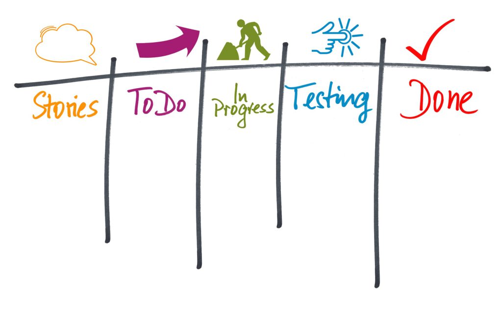
A Kanban Board is a visual representation of the work that needs to be done, similar to a whiteboard with sticky notes or digital board. It is divided into columns that represent the different stages of a task, such as “To Do,” “In Progress,” and “Done.” Each task or user story is represented by a card, which is moved from column to column as the task progresses. This allows teams to easily see the current status of their work and identify any bottlenecks or delays.
A Burndown Chart is a graph that shows the progress of a sprint. It typically shows the remaining work (usually measured in story points) on the y-axis and the days of the sprint on the x-axis. The chart is updated daily with the remaining work, and it allows teams to see if they are on track to complete the work within the sprint.
A Burnup Chart is similar to a burndown chart, but it shows both the completed and remaining work. It typically shows the total work (usually measured in story points) on the y-axis and the days of the sprint or release on the x-axis. The chart is updated daily with the completed and remaining work, and it allows teams to see the progress of a sprint or release.
These tools provide a visual representation of the work that needs to be done and the progress that has been made. They help to promote transparency and communication among team members and can be used to identify issues and make adjustments as needed.